Lissajous Curve #
![]()
A Lissajous figure is a visual representation of the relationship between two periodic signals plotted against each other in an X-Y coordinate system, with its shape determined by the signals’ frequency ratio, phase difference, and amplitudes. Figure: 300 Hz and 200 Hz sine waves (top) and their corresponding Lissajous curve (bottom), illustrating the relationship between frequency ratios and phase differences.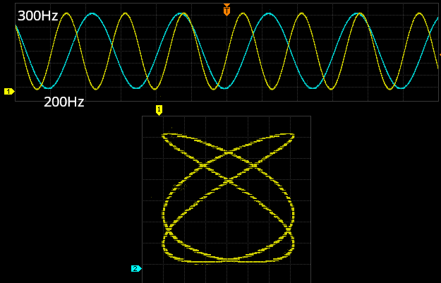
1. The Basics #
- A Lissajous figure is created when two periodic signals are plotted against each other in an X-Y coordinate system:
$$
x(t) = A \sin(a t)
$$
$$
y(t) = B \sin(b t + \delta)
$$
Where:
- $ A, B $: Amplitudes of the signals.
- $ a, b $: Angular frequencies of the signals ($ a = 2\pi f_x$ , $ b = 2\pi f_y $).
- $ \delta $: Phase difference between the signals.
2. Visualizing Phase Differences #
The shape of the Lissajous figure depends heavily on the phase difference ($ \delta $):
- $\delta = 0$: A diagonal line (positive slope) appears when both signals are in phase.
- $\delta = \pi/2$: A perfect circle forms if $ f_x = f_y $ and amplitudes are equal.
- $\delta = \pi$: A diagonal line with a negative slope forms when the signals are 180° out of phase.
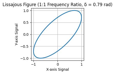
- Intermediate $\delta$: An ellipse forms, with the tilt and eccentricity determined by the phase difference.
Example for Intermediate $\delta$ #
# See code in notebook
3. Visualizing Frequency Ratios #
The frequency ratio ($ f_x : f_y $) determines the complexity of the Lissajous figure:
- 1:1 Ratio ($ f_x = f_y $):
- The figure is simple and reflects only the phase difference.
- Examples: Line, circle, or ellipse.
- 2:1 Ratio ($ f_x = 2 f_y $):
- The figure has two lobes along the X-axis and resembles a “figure-eight.”
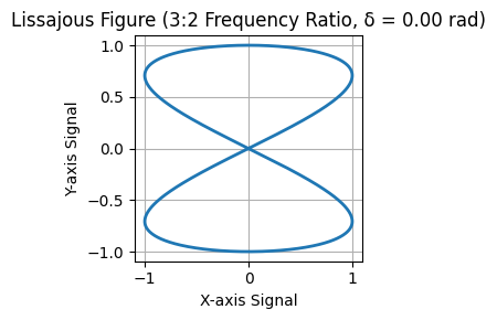
- 3:2 Ratio ($ 2 f_x = 3 f_y $):
- The figure has three lobes along the X-axis and two lobes along the Y-axis.
For more complex ratios, the pattern becomes more intricate, often requiring careful analysis to interpret.
Example for 3:2 Ratio ($ 2 f_x = 3 f_y $) #
# See code in notebook
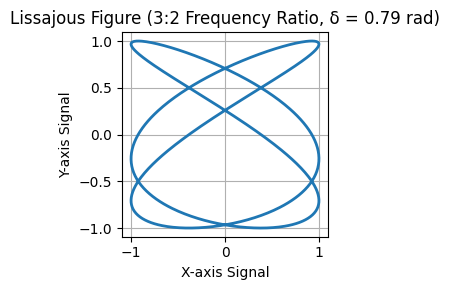
4. Combined Impact of Phase and Frequency #
- Shape of the Figure: The phase difference determines the orientation and symmetry (e.g., diagonal line, tilted ellipse, or circle).
- Complexity of the Figure: The frequency ratio determines the number of lobes or loops in the figure.
Example for Combined Phase and Frequency #
# See code in notebook
5. Practical Steps for Visualization #
Generate Two Signals:
- Use two sinusoidal signals with adjustable frequencies and phase differences.
- Example:
- Signal 1: $ x(t) = \sin(2\pi f_x t) $
- Signal 2: $ y(t) = \sin(2\pi f_y t + \delta) $
Set Up an Oscilloscope:
- Connect Signal 1 to the X-axis and Signal 2 to the Y-axis.
- Enable X-Y mode on the oscilloscope.
Adjust Parameters:
- Vary $ f_x : f_y $ to explore different patterns.
- Adjust $ \delta $ to observe how the figure changes.
Interpret the Results:
- Use the figure’s shape to determine the phase difference and frequency ratio.
Summary #
Lissajous figures are influenced by phase difference ($ \delta $) and frequency ratio ($ f_x : f_y $):
- Phase controls the shape (line, circle, ellipse).
- Frequency ratio determines complexity (loops, lobes).